Matt Grech
Content Marketing ManagerSmartling
User experience is everything. Simply put: if your mobile app, cloud service, website, or buying process is confusing and difficult, your users will lose interest
And this isn't just hypothetical. Research shows that 88% of online consumers are less likely to return to a website after a bad experience. Similarly, 90% of users reported that they stopped using an app due to poor performance.
So, if your app or website is difficult to navigate, it won't be used.
Now lets add language into the mix. Looking back to CSA Research's report from 2014, of 3,000 global customers, a massive 60% said they would rarely or never buy from English-only websites, and 75% of participants said they want products to be offered in their native language.
So, if users can't even read your app or website, it won't be used.
We can tackle this problem from the beginning by considering localization within your user experience design process.
Localizing user experience
Localization and user experience go hand-in-hand. If users can't even read your app or website, they won't use it. That much we established already.
After all, localization is the process of adapting a piece of content's full meaning for a new location or culture.
Therefore, properly localized content should feel as if it were designed and created for users no matter what language they speak. Users should experience your solution as if it were designed for them in mind.
What is user experience design?
The user experience of your website or app is just that: what the user experiences when interacting with your solution. It’s how they navigate menus, how quickly pages load, how easy it is to find what they need, how responsive your app is, and even how much fun your app is to use, or how satisfying it is to complete an action.
Asana great example of an enjoyable and fun user experience.
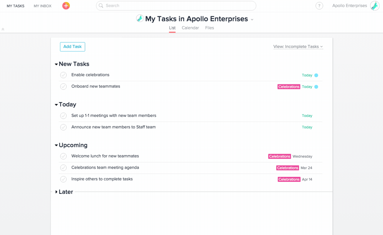
When you complete a task, it doesn't just disappear from your list. Instead, you're congratulated with a splash of color and a fun little animation. These little details are what set a great user experience apart from a dull app or website.
User experience designers work to develop a solution that is accessible, easy to use without sacrificing complexity, and of course enjoyable.
Internationalize your user experience
Proper localization should really begin at the conceptual stage. As you plan and design your user experience, your brand should aim to build a platform that can adapt.
Internationalization is the process of building your application or product to support multiple languages and writing conventions.
Internationalization requires developers to account for localization from the beginning, within the architecture of the application, enabling a smoother process down the road.
User experience localization best practices
UX designers should support localization early in the design process with these considerations in mind:
Font choice
Apps are filled with text. It is how users navigate apps, identify icons or symbols for the first time, and, of course, how we communicate.
That's why font choice is so crucial for a positive UX: users need to be able to identify and read text quickly and easily, on all screen sizes and resolutions.
When localizing your UX, you will want to choose a font that can support multiple languages, not only with different characters but with spacing requirements as well.
Right to Left and Left to Right
Of course, not all languages are written and read in a left to right format.
UX designers need to incorporate support for not only left to right, but right to left flowing text as well -- and we don't just mean your font choice.
When you flip the language direction, the entire navigation and layout of the UI will need to change as well. Icons and menus on the right might have to be placed on the left, or vice versa.
Place labels above fields
Whenever there is an input box in your application, whether for someone to type in information or select an item from a menu, the label for that field should be placed ABOVE the box, not to the left of it.
By placing the label above the field, you gain far more space to play with as the language changes.
Meanwhile, if the text was to the left, and the translated word grew 30% in characters, you'd have to push that box off to the side, altering the layout.
Consider Color and Design
A lot of nuance can be conveyed with color, and we often use color to signify different sections of an app or website.
But colors have different meanings in different cultures. In Eastern cultures, red represents good luck and joy, while in the US it represents "stop" or "error."
Utilize icons, imagery text labels and other distinctive elements to help users navigate and avoid any cultural faux pas.
Don't Forget Icons
Over time, icons have become standard representations of different elements, no matter the language.
This is because icons are immediately recognizable to users, simplifying navigation for an easy and frictionless user experience. Which icon is “save”? Oh yeah, the same that's always been!
Employ icons whenever possible for any elements that don't require a written label. This will help both reduce the amount of translation and redesign necessary when localizing.
Flexible text elements
There's a lot to unpack here. The biggest challenge with localizing your UI will be around the changes in word and string length. In fact, this is a pretty big reason why we developed visual context, so translators can see how their strings will fit into the UI.
But that doesn't mean you can't plan ahead. As a basis, you can design your UI for the "largest" text.
Meaning, if your website is available in German, design your buttons and navigation to fit the longer German words, instead of designing for shorter English words. Alternatively, developers should avoid relying on containers and elements with fixed dimensions so they can be resized as necessary for different languages.
Don't hardcode any text
It's important to be aware of the relationship between text and images, as well as alt-text, menu labels, and other potentially hardcoded text within your UI.
If the strings cannot be parsed and extracted by a translation management system, then they might not be included in your translation workflow, or will add in an extra manual step.
All of your text elements need to be easily pulled from the source content for professional translators to do their work.
User experience is everything
Remember, the experience users have with your solution is critical. Sticky experiences keep users coming back, frictionless experiences make it easier for users to complete their work, and poor, clunky user experiences drive people away.
But it all starts with language. You can have the flashiest design and the simplest workflows, but if users simply can't read your app, they won't be able to use it.
When building a solution for global use, it's imperative to consider language within your UX Design. And incorporating localization from the beginning will be the easiest path to adapt and localize your app for even more users down the road.