
Matt Grech
Content Marketing ManagerSmartling
Every little detail matters. You want to make your website as easy to navigate as possible, and you want a satisfying experience to keep users coming back.
This requires precise attention to detail and some creative thinking to innovate. A great example is designing the language selection menu on your site.
It seems simple at first, right? Maybe a quick drop-down menu listing different languages, and some flags for visual aid.
Of course, that's a quick and easy fix, but it doesn't foster the best user experience possible. Who wants to scroll through an endless menu? What happens on mobile when you can only display 20 languages at most at a time?
There's a lot to consider when designing a great language selection menu for your website.
Why do we need a language selector?
The goal behind localization is to make your website as accessible to users as possible. But what good would a localized site be if the user never has the option to select their language?
Now, this is a great scenario for automation.
Simply configure your site to automatically detect the user's location via IP address, or even better, their web browser's default language, and serve that user with the right localized version of your site. But that only works when you localize into specific languages.
When designing for French and English markets, users with their default language set to English see the English site, and those with their browser set to French see the French site. Any other visitor without these two options should automatically be directed to the most popular choice, in this case, English.
What if that user doesn't even speak English, but they speak French? Now they're stuck on a website they can't read.
And it wouldn't work well if you default based on location, either. What if you have a website visitor from the U.K., and they're shopping on your U.K. site, but would prefer to browse in their native language, German? Defaulting them to English forces an experience they might not want.
And that's where the problem lies: users still need the option to choose the language they prefer.
Automated language selection handled well
ASOS offers the perfect example of a successfully localized eCommerce platform. ASOS has achieved 149% over the last 5 years solely through digital sales, surpassing even established retailers. All without a single physical store location.
Part of their success is in their seamless localization experience. ASOS leverages automation to automatically select both the user's language and currency preferences, and more importantly, when they're directed to the incorrect location, ASOS includes a little prompt as an anchored footer:

They're both enabling the user to browse a foreign version of the site while pointing them in the right direction. This is just a sleek approach that incorporates a lot of the best practices we're going to cover.
Website language selector strategies
So, how do we design and implement a language selector for a seamless experience?
Just like with translating user-generated content, there isn't always a one-size-fits-all solution. Let's run through some common strategies.
1. Selection Menus
Menus work well when you have a lot of languages to deal with. The easiest option to design and implement would be a simple drop-down menu.
Where you house this on your website will come down to individual design, but you'll commonly see them on the top right or bottom of the page. Simple enough, implement a drop-down menu with a clear label and include every language your website has been translated into.
You'll have some options for the best implementation based on your needs:
- How will you organize the menu and represent each language? You could separate the menu by region or continent and include every spoken language offered for easy navigation.
- Will you list languages only, or list countries multiple times for different languages?
- What kind of icon or button will you use to highlight the menu? It'll need to be recognizable
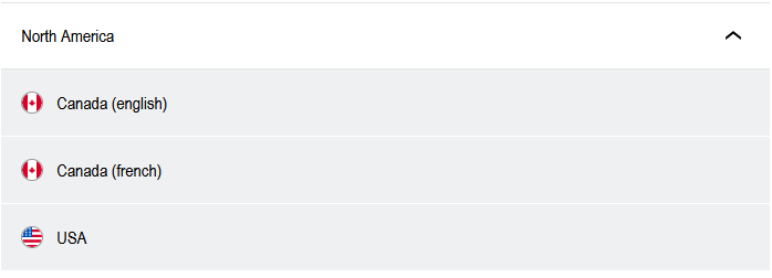
Porsche is a simple example of a clean menu for users visiting their international site that incorprates a dedicated menu with flags.
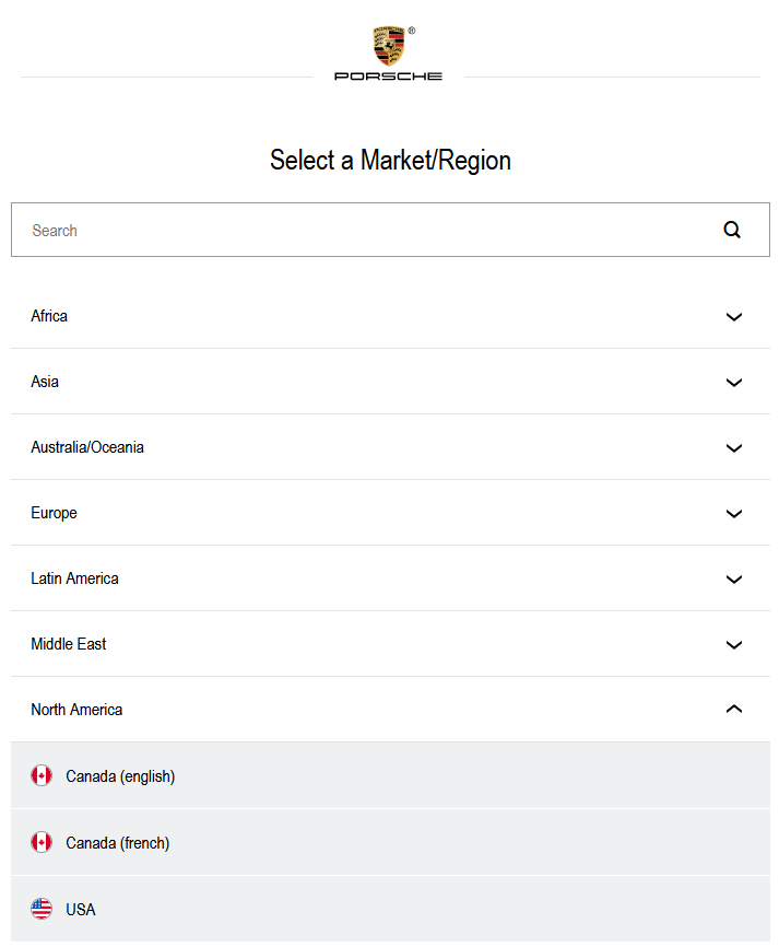
Separated by region, users can quickly find exactly what they need without having to wade through a massive list. They've even included a search function for an extra touch.
2. Dedicated Language Buttons
If you're targeting a very specific market, for example, you only see to the U.S. and need to localize for Spanish and English, you can include language buttons on your website's navigation menu.
A simple selection enables users to opt-in and quickly flip over to a localized version of the page.
There are still a few considerations to make:
- The biggest design challenge here is space. Any more than two languages and it'll get busy fast.
- You'll also need to carefully consider exactly where these buttons live. They shouldn't be in the way of content or a major focus of your navigation, but they also can't be hidden. We want to minimize clicks for users.
USA.gov is one of the most popular examples of this, offering users the option to instantly translate the webpage into Spanish.
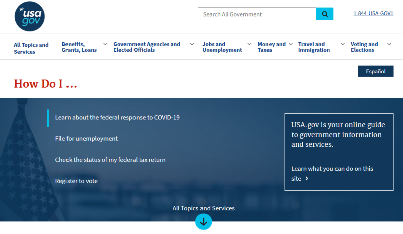
Simple, easy, and quick.
3. Text links
You can also keep it simple with text links, generally housed in the footer of your site, for each localized version. This works great as a middle ground between dedicated buttons and selection menus when you don't have enough options for a full menu, but too many for individual UI buttons.
Challenges and considerations here are of course space limitations, and either a dynamic or static approach:
- Dynamic would mean looking at the IP of the visitor to determine the rough location and serve the appropriate text link(s) for that region.
- Static would mean incorporating text links as a permanent fixation in your UI, like the aforementioned example of including text links in your footer.
Google is a great example of this. When you visit their French URL, google.fr, you'll start in English.
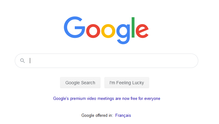
But there's a simple link at the bottom of the page that directs you right to the French version.
A word on flags
It might seem like common sense to include flags in your language selection menus. They're easy to identify to simplify the UX and add extra weight to the design.
There's a lot of nuances, and even politics, involved. Not all nations recognize the same flags, and no one country represents a specific language.
For example, you wouldn't want to use an English or U.K. flag for Ireland, despite both countries speaking English primarily, the Irish would rather have their flag and country represented.
One easy way around this would be to just list the same language multiple times, and specify which country that site is localized for with the flag, like what Porsche does.
But you'll also have to determine the best way to implement the designs; some flags are intricate, how will you design them in a familiar format that's quick and easy for development?
It might be easier to forego the flags altogether.
Website language selector best practices
There are some standard best practices that you should adhere to when designing a website language selector:
- Always use the local format and spelling of the language. It needs to be recognizable instantly to native speakers. For example, German should be listed as Deutsch.
- Automation is great to have, but you want visitors to have the option to tailor their experience
- Make it easy to find, you don't want to end up frustrating visitors. Redundancy helps a lot, and it might make sense to combine strategies like a menu up top with text links in the footer.
- Avoid flags unless content is specifically tailored to that individual country.
- Implement visuals like a globe or even a map for a more visual experience.
- Be careful implementing a drop-down menu, especially when designing for mobile with limited real estate.
- Don't forget to tailor the currency based on the visitor's location, and even provide an option for users to specify the currency if it isn't already localized
But don't be afraid to get creative. There are some great designs and implementations out there, and this challenge requires some unique innovation if you're trying to develop the best user experience.